Chosen Specialisation: Photography
My interests in photography:
I like to do commercial photography, such as photographing still life, food, fashion and creating magazine and poster covers etc. My interests are also the difference between time, so that I find time and change interesting by the effects and change on things over time. For example old factories that use to be in use such as Jarmain & sons. I also like the look of how fashion has changed over time and how it has been the same.
My Brief:

Mindmap of photography ideas:

Mood board of photography ideas, Editorial designs, lighting diagrams and other things that are from the 1990's I will use or take inspiration from:

|

|

|
Questionnaire to be answered by 8 people:
Do you understand from my mood board, mind map and brief what I am doing for my final project?
- Yes, I understand that the general idea is that you want to do a project based on 90's fashion.
- You want to improve your Photoshop and fashion photography skills, by replicating pictures you've found online showing 90's fashion. You're going to style the models yourself.
- Yes, I understand what the general idea is for the project.
- Yes I do, the mood board is very detailed and has a lot of variety, the brief is very detailed and understandable ,the mind map is good but could be improved.
- You have made it clear that you have a 90's theme going on and how you will be developing your ideas.
- You have definitely made it clear that you are basing it on the 90's and how you will be creating and editing them.
- Yes, I understand what you are going to do for your final project. The mood board gives good examples and clarifies any questions I had.
- Yes, I understand what your final project is about.
- I would do a more in depth mind map and this can be done by going into more detail about certain models or certain ways you could present the images
- Maybe think about specific lighting techniques used in fashion photography, to focus on and practice?
- More in depth mind Map. Explore more ideas etc.
- By adding more detail to the mind map and making sure the that the shoot is planed before doing it.
- Maybe make your mind more explanatory as you have the examples of what you may do but you haven't delivered any further ideas as to what you will be doing.
- You could use different lighting diagrams for your photos.
- Perhaps look at the mind map and expand on ideas.
- I would make sure that you have a variety of images.
- The best plan was the mood board. It showed a lot of detail into what you're specifically targeting and wanting to recreate.
- Brief and mood board.
- Mood board was very in depth and well done.
- I think the mood board was the best because it was very detailed and had a lot of variety.
- I prefer your brief as it goes into more detail.
- In my opinion, I think your best way type of plan is your mood board because it shows the contrast and details in each photo.
- I really liked the mood board because it gave examples of your thoughts.
- The best way you showed your plan is by your mood board.
- I would just suggest making more effort to put more detail into your work so that if you were to give it to someone to do the work, they would be able to do it without any further instructions.
- It's good! Try find lighting techniques to practice.
- Some more detail into mind map to explore more areas and ideas ;).
- Make sure that you pick just one idea because there were lots and It could be easy to be overwhelmed.
- Find different examples from all corners of 80s/90s fashion that will help inspire you.
- I would suggest put more effort into the editing of the photos.
- I would think about your ideas and how to investigate them further using the mind map.
- I would experiment with different editing techniques.
Image analysis 1:

The location is outside, it looks like it is a casual day which will make me feel like this look is casual as well. This makes me feel like it is a normal day and the person and what they were wearing actually looks really good. the clothes look natural and not like they cost a lot of money. The flannel shirt and the baggy jeans makes it look relaxed and that the person/ model doesn't seem to be uncomfortable. The look of this image makes me feel like I would wear this if I could or if I had the money to buy stuff that is similar to it. The clothes don't look bad especially the way the model and the lighting has been used to make it seem relaxed, casual and the lights compliment the clothing. The background looks blurred so that your main focus is on the model and the clothes.
Image analysis 2:

The body language of the model shows the clothes off. The lighting enhances the colours of the clothes even though they are in black and white. The clothes look comfortable and the model make them look as if they are casual and they would make a good relaxed day if you were going out to meet a friend. They look and have been presented as being something you would want to buy seen as they look very good and they are shown in a way where the lights make the clothing and the fabric look good and it enhances them.
Image analysis 3:

This image makes me feel as if I have just seen a random person in the street in clothes or an outfit that I like and I wanted a picture of it so I could recreate it. This makes me feel as if the person is just enjoying his day outside on the street and he is looking back at his friends who have just shouted his name because it look so calm, relaxed and not like he has been told to pose that way and looks as if he just found some clothes and put them on. I like the scenery in the background and how it is blurred out so that your main focus when you look at the image is on the guy in the image in the bright clothes and the kind of clothes that we wear now yet for some reason it looks better, I think it is because at that time everyone liked each other and no body had problems or fights or stabbing and killing each other it was a more peaceful time and now it is show as the fashion you are judged by but here you aren't.
Image analysis 4:
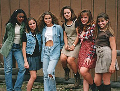
The reason I like this image is because the way they are wearing different clothes that are different to each to other and how they all look friendly and like they are friends. Yet, now a days people are judged on what they wear and how people can't hang around certain people because of what they wear so here I really like how that isn't shown. The background is plain yet it kind of tell the story how each of these people have these clothes on that are able to be worn outside and not have to worry about what happens to them. The variations of style, next to each other looks good and it makes you think about what other styles you might want to try and it also shows how each of the people in the image have their own style and don't copy each other.
Image analysis 5:

The reason I like this magazine cover and the editorial design is because there is some more colour and different fonts for certain pieces of the text, which makes you as the audience draw your attention too it instead of having all the text the same and it looks more sophisticated. The reason I feel like I want to read this is because they are not overloaded with information and they just stating the main points and facts that are in the magazine. The white background makes the text and the model stand out. The reason the magazine is so good to look at is because when it was published there wasn't any certain way to dress, seen as the society in the 1990's allowed people to express themselves in their appearence and not get judged and have people censure them. The recommended audience for this, I think would be a slightly younger audience maybe in their teens seen as it still has some bold colours to draw your attention. However, the way it is set out is still more mature than if it was for a child around the age of 12-15.
Image analysis 6:

The reason I like this magazine is because it makes many people look towards it seen as some people see that Cindy Crawford is on the cover and may see that it might be worth reading. Yet, other people who would see this magazine would probably notice it by the large font and some hints of bright colours to draw the reader in. The blue background doesn't create a too strong of a demeanour which doesn't make the reader feel blinded or have the eye strains. It creates a sense - to me - that it is like a warm welcome. The society in the 1990's didn't limit you to what you could wear and the makeup you could wear and the magazine tells you about what is more interested by the public, nowadays it is only about the celebrities lives and then a fraction of it is about fashion. the editorial design of this magazine is that it still makes a certain audience the main focus for vogue is for more older range of people and the text could make some younger people to get intrigued in this type of magazine.
The 2 Ideas I will pursue for my outcome:
Idea 1:

Idea 2:

Lighting diagrams for my photoshoot:


90's Fashion photoshoot positions to stand:


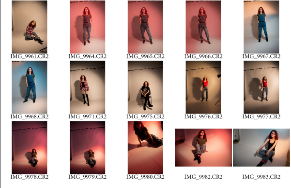
Contact sheet of my photoshoot:
How I will be editing my photos- colour casting:
A colour cast is used when the lighting you have used in your photographs has been overpowering and has been noticeable in your photographs. Colour cast is a wash of colour, if the colour cast makes your photos look unnatural you can try correcting it by going to layers panel> click the create fit/ adjustment layout icon> and choose levels and experiment until it looks better.
Photoshop colour cast simple way:
In Photoshop there is a simple technique to do colour cast, the video is www.youtube.com/watch?v=mkAINyEvQdk .


Lightroom colour cast :
In this link there is a quick removal video to get rid of colour cast in Lightroom, the link is www.youtube.com/watch?v=fe1Q8uG1pzM


